For: Absolut
Skills: Creative Direction, UX & UI Design, Illustration, Design for Print
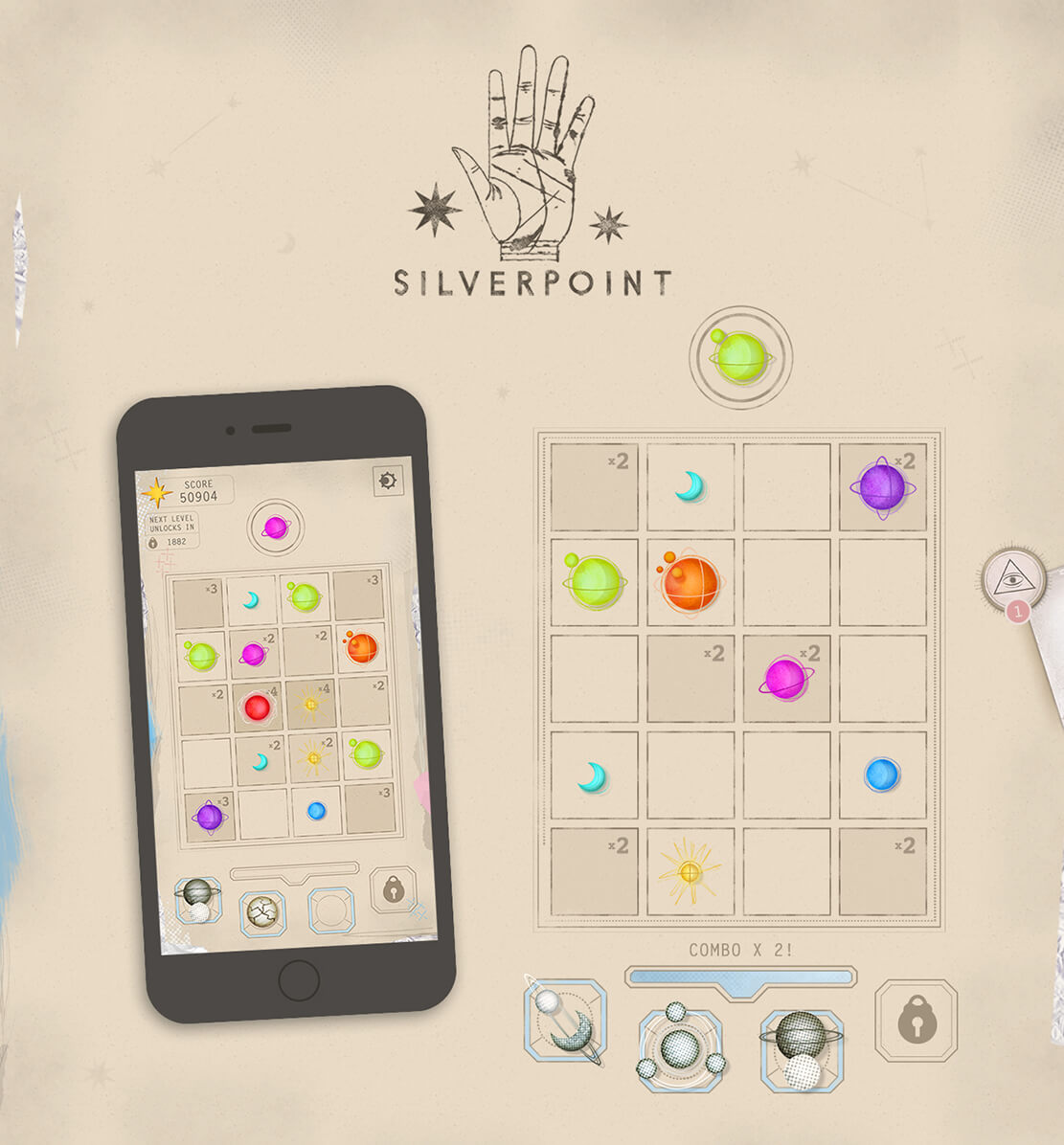
The project was inspired by artist Andy Warhol’s Silverpoint sketches and commissioned to celebrate the release of Absolut’s limited edition Warhol vodka bottle. The experience unfolds as players download the app and learn of a missing girl named Chloe, who disappeared after playing a game. As they begin to play the same ‘match three’ game, they amass star points and unlock fragments of her story.

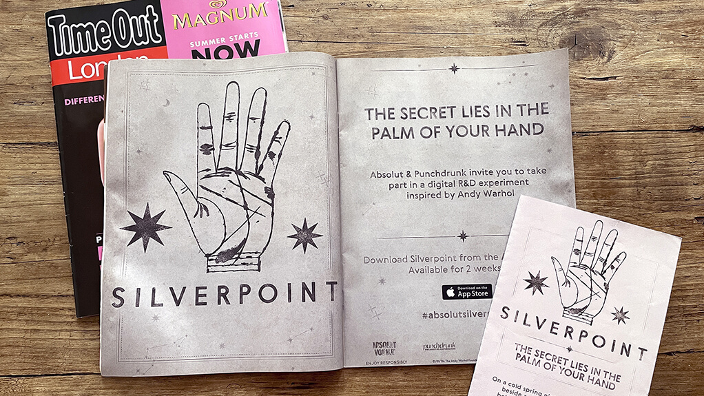
Over a three week ‘live’ period, qualifying players would then receive mysterious prompts via the app and be invited to real London locations. On arrival, as their phones connected to pre placed iBeacon technology, they would automatically ‘level up’ in the app. At the same time, they would encounter Punchdrunk’s colorful cast of characters and elaborate sets. The story culminating with a spectacular final performance for a lucky few. My involvement in the project included; development of initial concepts and of a strong UX tied to live dates and locations. Full design, from early moodboards and experiments to creating the final polished interfaces, game assets and illustrations. Finally, creation of artwork for the extensive advertising campaign which included web, print design and hand lettering.
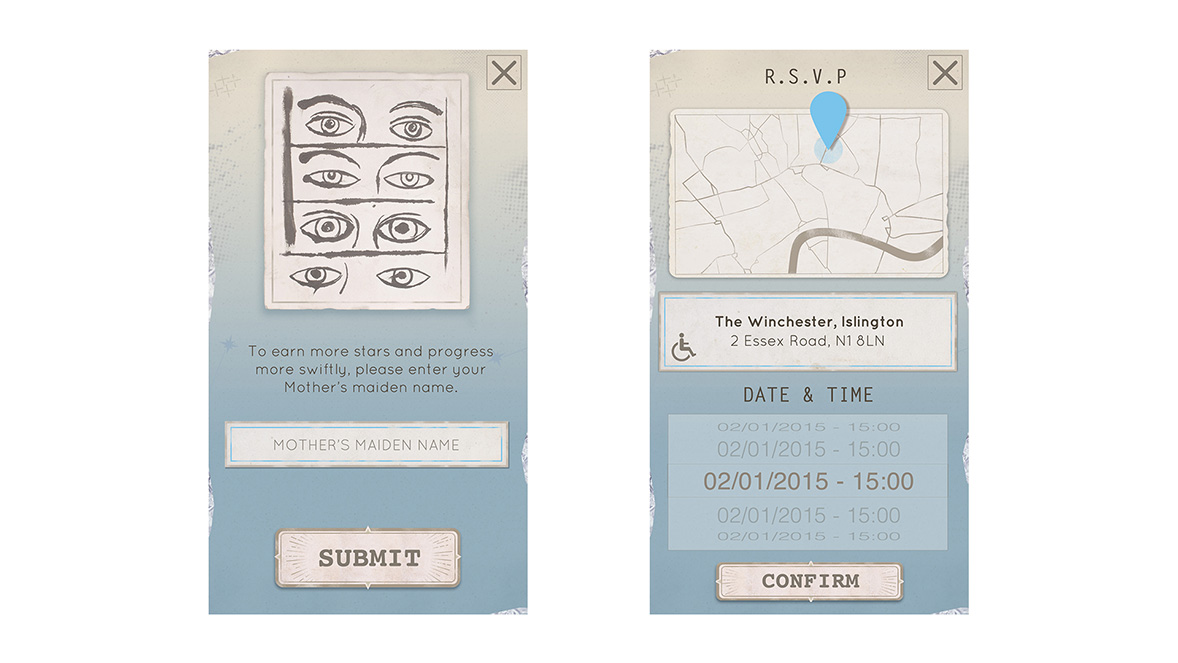
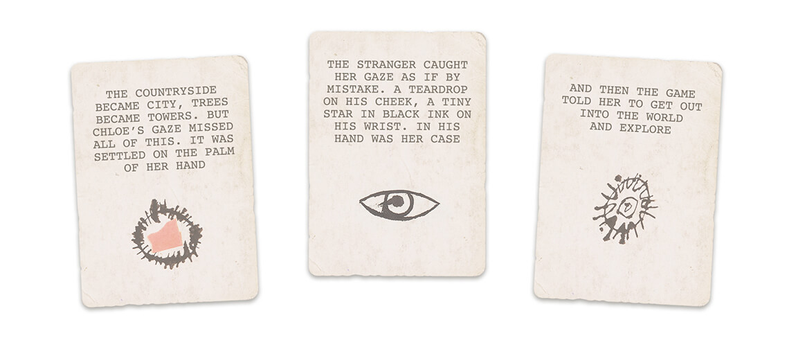
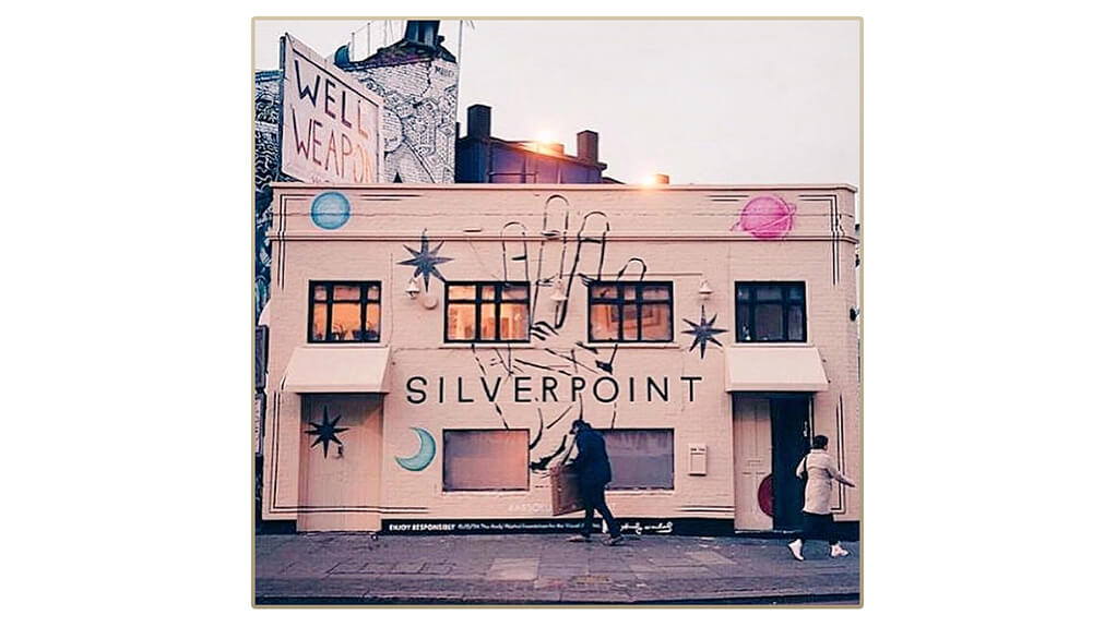
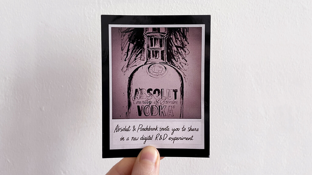
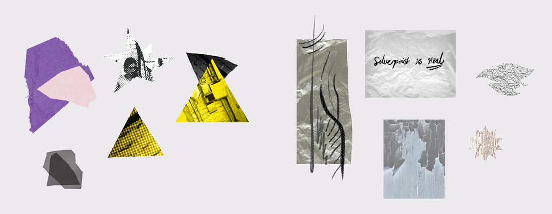
We wanted to ensure that the match three game mechanic was as fun and satisfying as possible, early on I worked closely with the developers in prototyping this. At the same time I began work on the design phase, experimenting with a variety of styles before we settled into the direction we were happy with. The project took on an astrological, vintage look that worked well with Warhol’s Silverpoint sketches and neatly supported the story that Punchdrunk were developing.
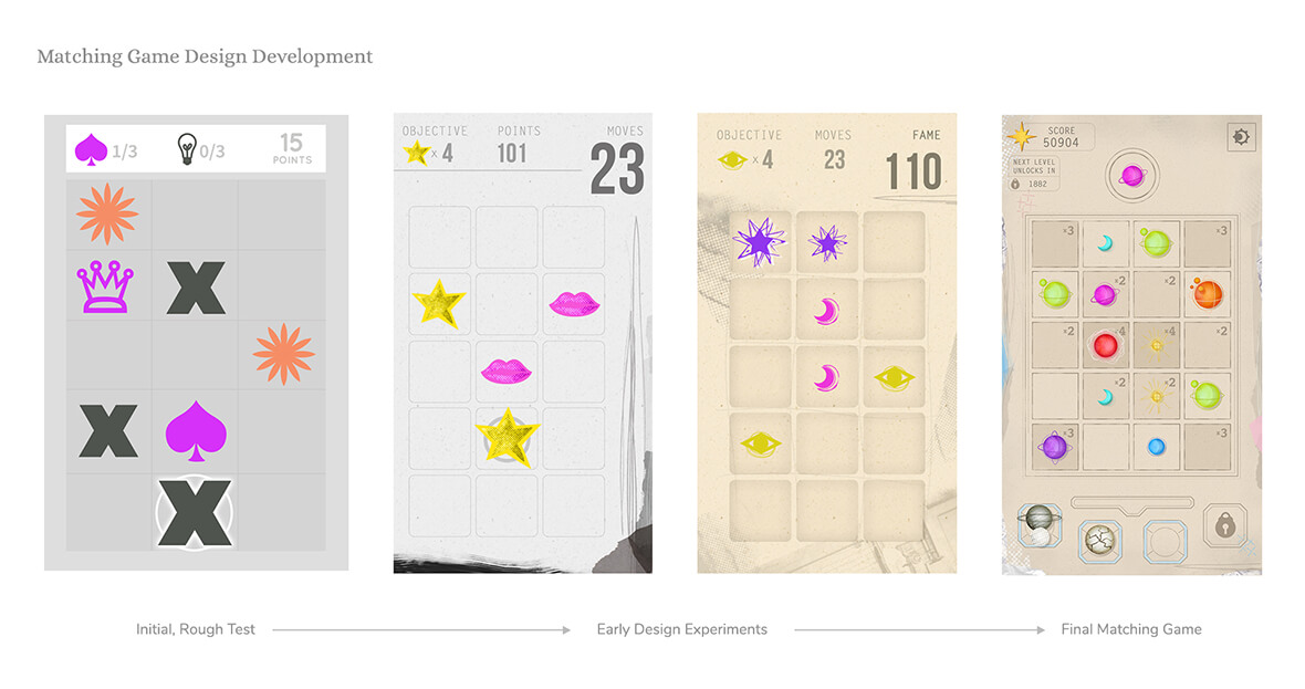
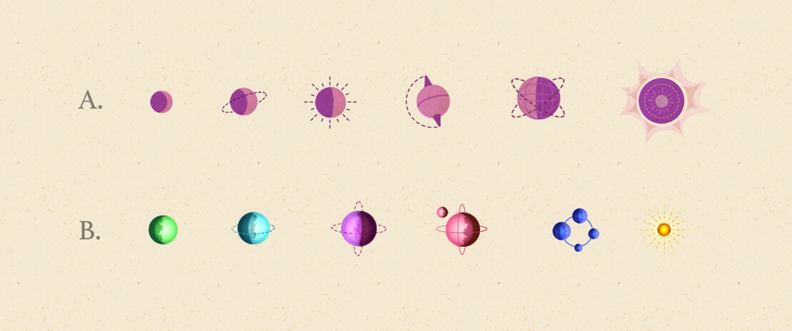


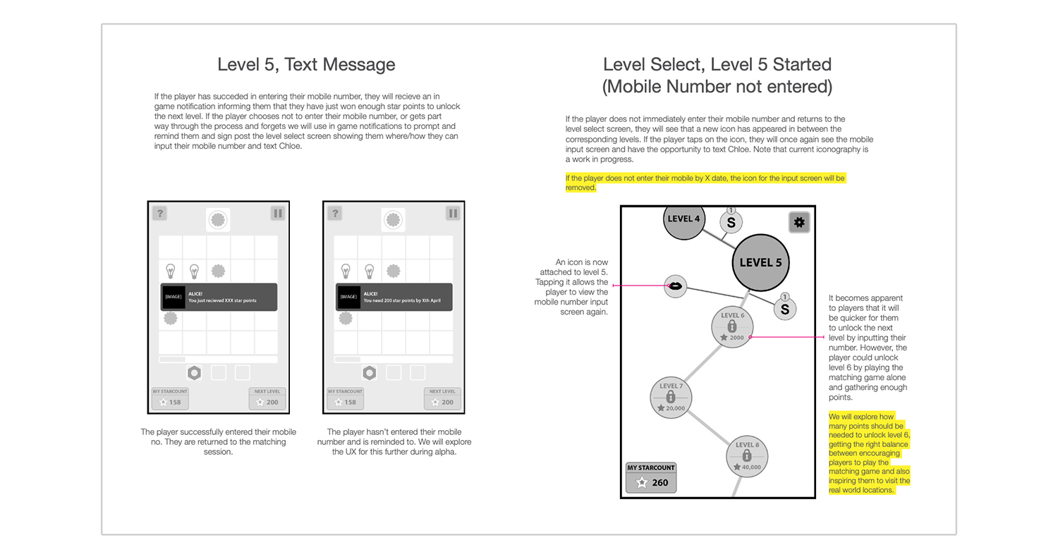
We had to craft a very detailed and considered UX, that would see some players unlocking levels and earning enough points to be invited to the live events, whilst those who didn’t amass enough points would still be rewarded with narrative unlockables and still have a great experience. We had to figure out how the game could enable this – how many points would unlock a level, how timed notifications and hints could help players through the experience, but without too much hand holding or removing the mystery. When we had firmed up our ideas, we created iterative wireframes and flow diagrams to help us solve these UX and UI challenges before moving on to design.
The project was really well received by Londoners, garnering a bit of a cult following across social media as people got addicted to the matching game and shared their theories on the protagonist’s disappearance. It also went on to win several awards including ‘Best Interactive’ and ‘The Chairman’s Award’ at the 2015 Drum Content Awards and the ‘Compelling Content’ award at the 2016 Marketing Week Awards. I love working on innovative projects such as this one, that weave together storytelling, art and atmosphere to leave a mark on the player.

