For: Imperial College London
Skills: Wireframing, UX & UI Design, Character & Environment Design, Logo Design
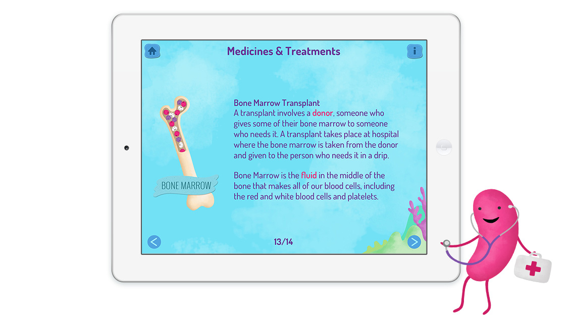
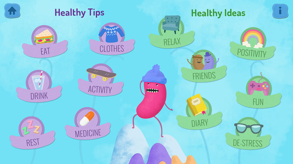
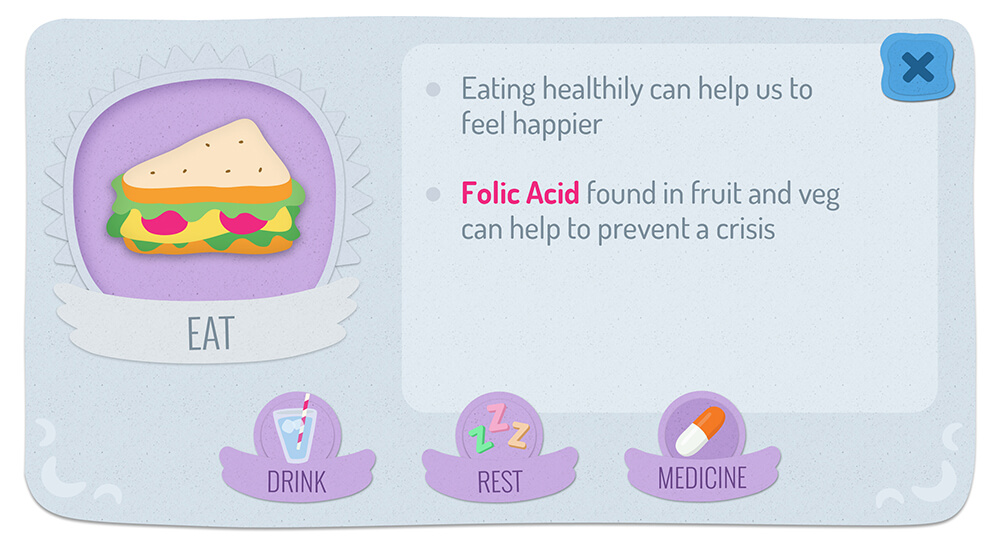
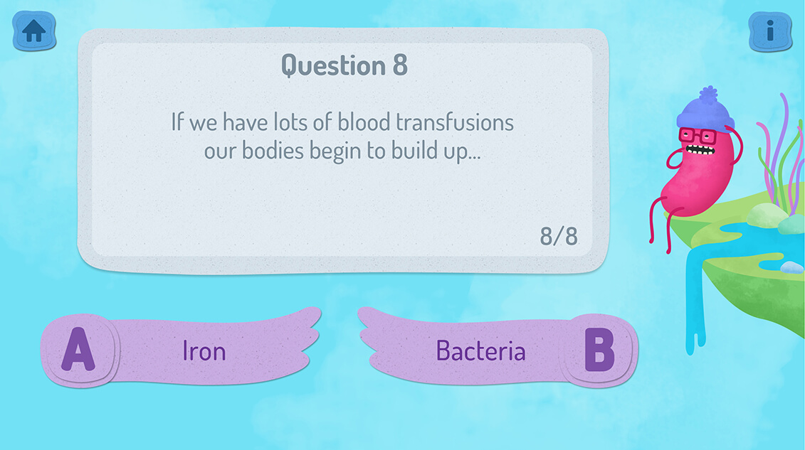
Prior to this project I knew very little about Sickle Cell disease. Luckily I was teamed up with Sickle Cell expert Dr Kofi Anie, who helped me understand the key information we would need to include and present to children, in order for the app to prove useful to them. We also discussed how we could make it fun and calming to use. We developed three main areas within the app; a ‘Facts’ section and ‘My Health’ guide that help children to learn more about the disease, followed by an interactive ‘Quiz Zone’ to help them test their new knowledge.
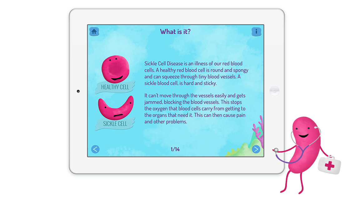
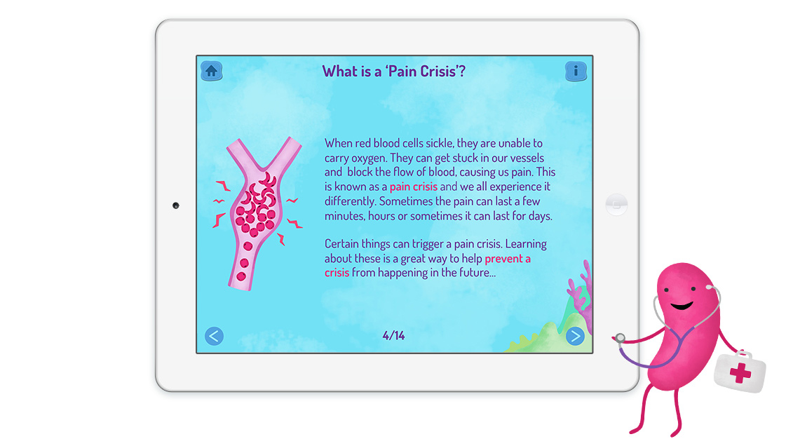
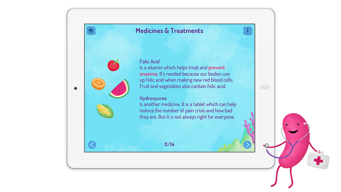

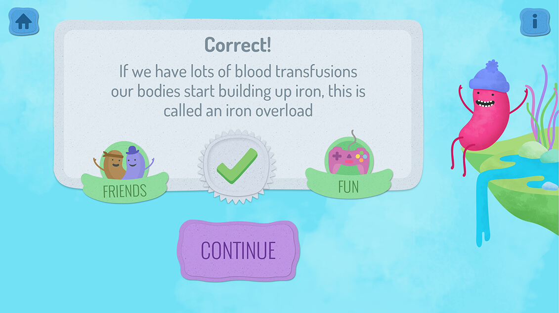
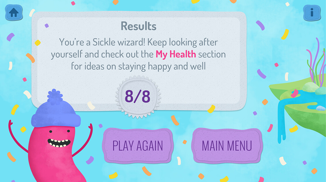
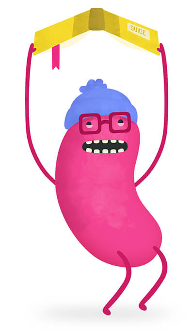
The pain that Sickle Cell causes can be quite scary for young sufferers. I developed designs for a friendly character who would help to guide children through the app experience. I also worked on a variety of logo design directions. We wanted a bold and colourful logo that would appeal to children as well as their parents who may download the app on their behalf.
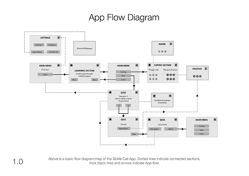
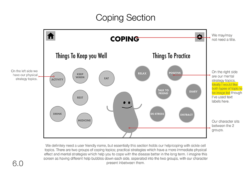
At the very beginning of the project after we had discussed our ideas, I created an app flow diagram and a set of wireframes. Before any design began, we worked iteratively to firm these up and form the basis of a strong user experience. I then used these as ‘blueprints’ from which to create the polished, final designs.
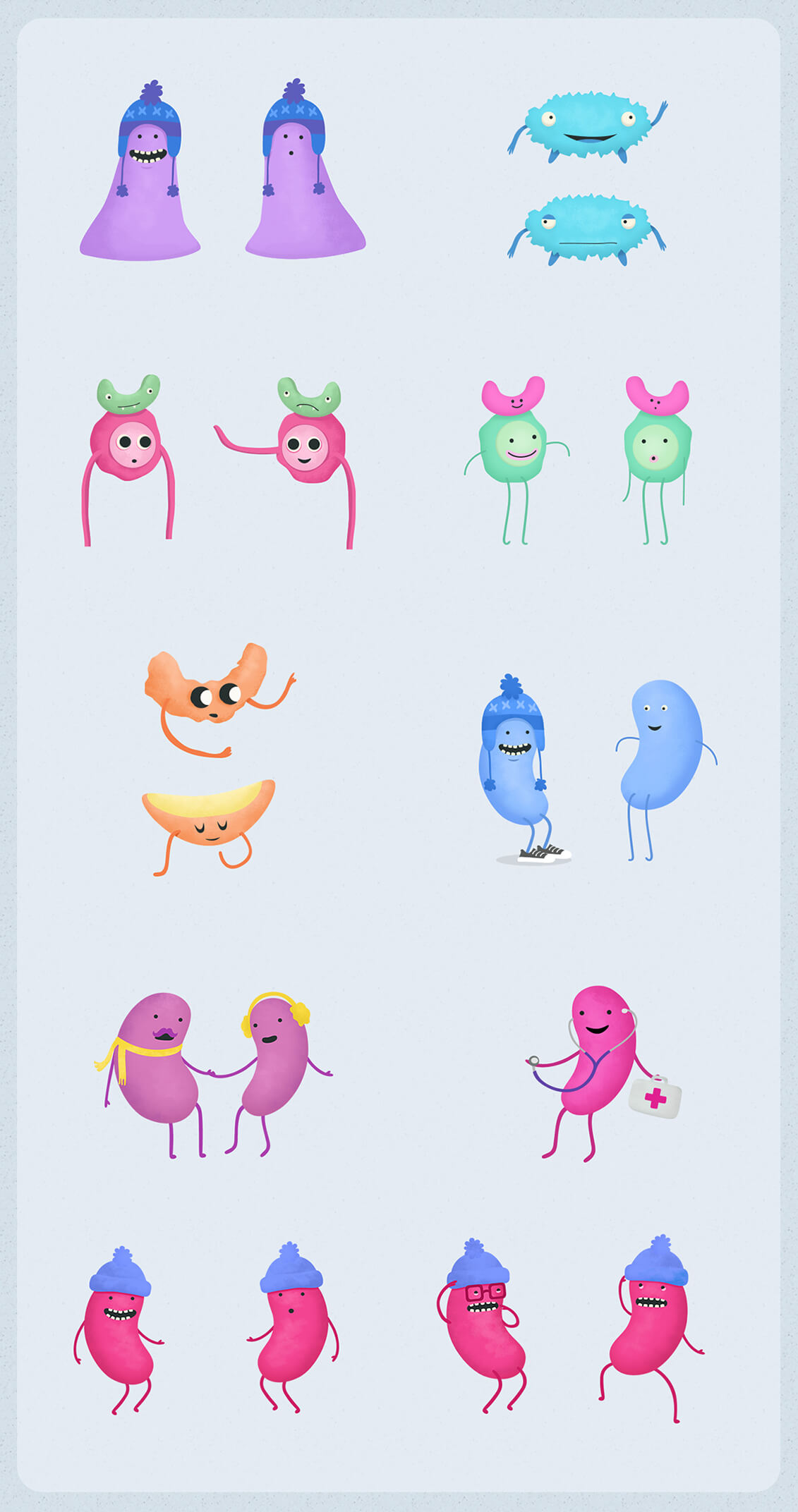
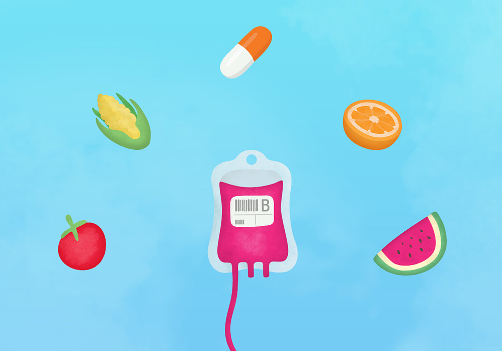
I developed a bright, playful illustration style for the project, creating a range of assets that were used throughout. This helped us when explaining some of the trickier parts of the disease to children.
Out of scheduling necessity, the app wouldn’t be built by the developer until after my design involvement had come to an end. So unfortunately we weren’t able to work collaboratively on this occasion (which I find usually leads to the strongest results). However it was a great project to be involved in and turned out well. I love creating for projects that have the potential to make a positive difference to people’s lives!
